Brittanee Fritz with non-architect guest Marietheres Preißler
Using the procedure ‘WHAT -> HOW -> WHY’ we were able to gain a lot of insight into the intuitive experience of space as a user and not an architect. Through this sequence we first experienced selected spaces through our bodily senses rather than the typical approach as an architecture student to analyse space. Throughout this procedure we were able to learn first-hand about the power of space and atmosphere. Following our intuitive experience, we then asked ourselves what architectural tools were used to create the spaces we visited. In a final step we researched the context of the built spaces and found answers to why the architects made these specific design decisions which ultimately led to our experiences. Through sharing this procedure with a non-architect we were not only able to teach someone else how to intuitively experience space but we also learned more about this phenomena through the eyes of a user.
A visit to the Bergarchiv in Schloss Freudenstein, Freiberg, built in 2008 by AFF Architekten…
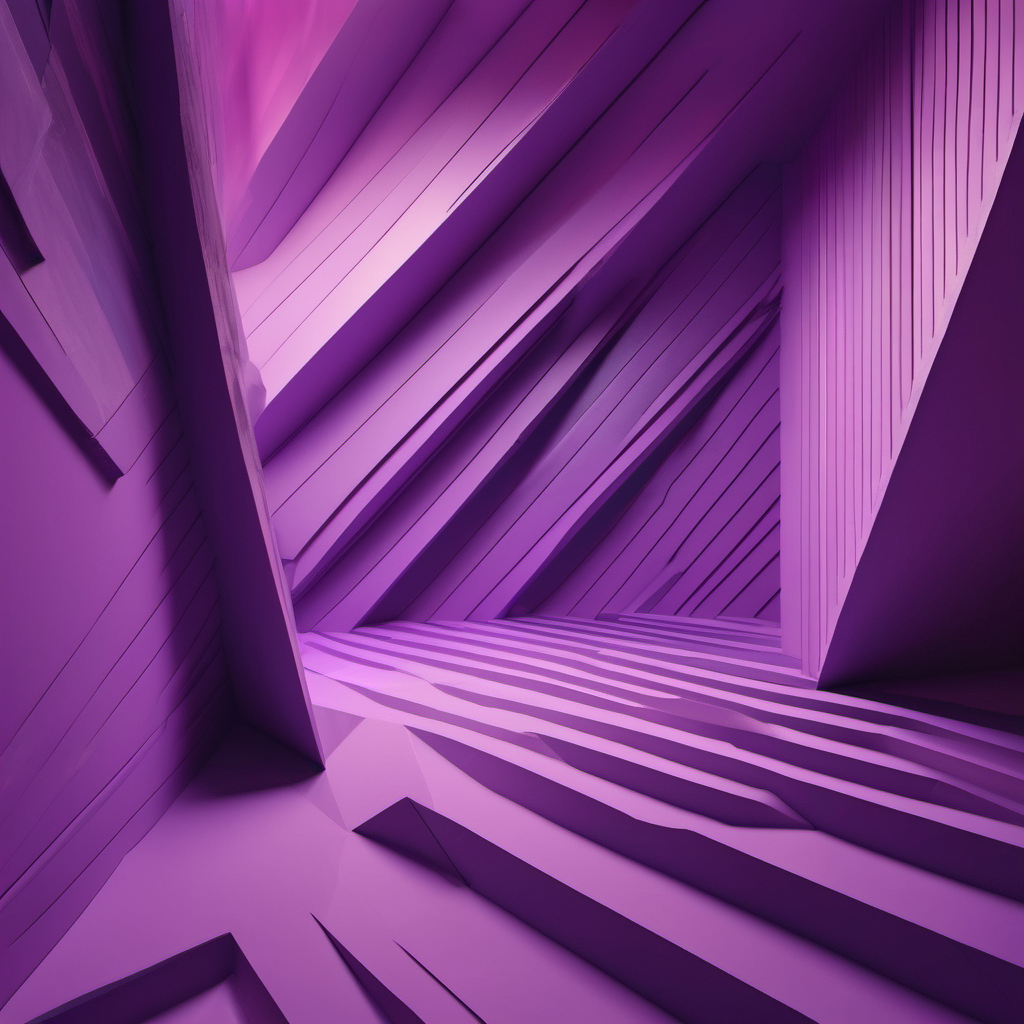
OVERWHELMED
uncomfortable space
diagonal lines and walls
everything is purple
WHAT
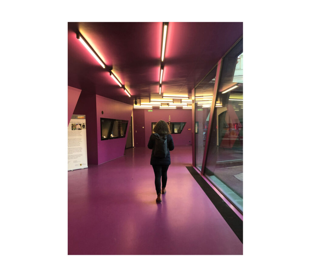
CONFUSED
The first thing I noticed was the colour. It was an uncomfortable colour and was too intense for me. I didn’t feel very welcome into the space. I felt unsure. It was loud. There was lots to look at in this space and it was all very distracting. It was a sensory overload which also awakened a bit of curiosity in me as I wasn’t sure what was going to come next. I had to stop for a moment to get my orientation and to try to figure out where to go next. I found there were little signs or information pointing in which direction I should go. It was all very unclear and confusing. After being in the space for a few minutes, I started to notice that I felt guided towards a door that looked like the entrance.
HOW
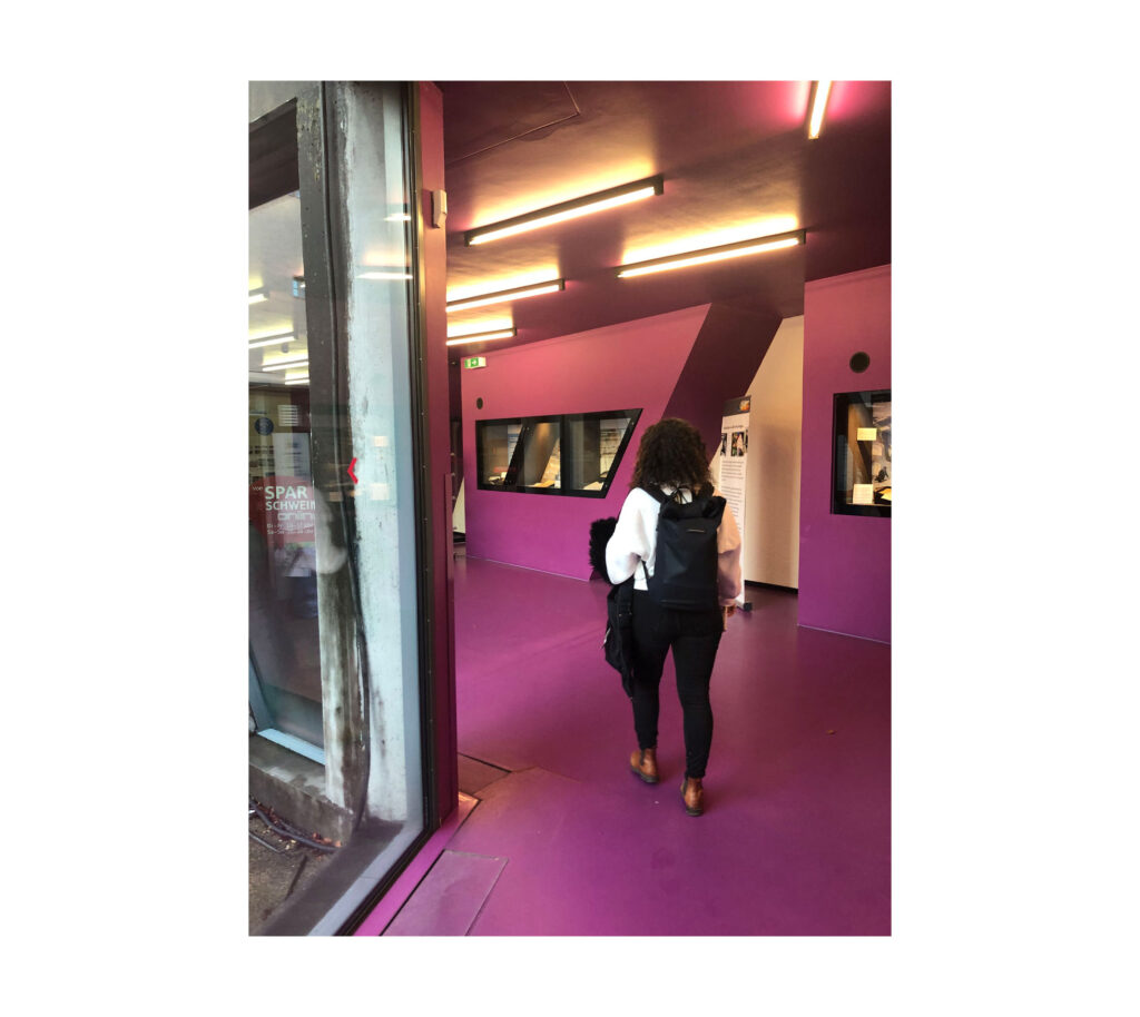
DISTRACTED
The entrance building is full of many spatial qualities that together produce a rather discomforting and overwhelming spatial experience. The use of just one strong colour – purple, which appears not only on the walls but also on the ceiling and floor, makes the user lose their sense of orientation. The surfaces on all walls, floor and ceiling are all the same material and without junctions which also provide for disorientation. Another spatial aspect that allows the user to feel unsure and confused are the many diagonal lines that are found within the walls, windows, cabinets, doors and even the floor plan. The addition of strong diagonal lights that may help to provide a clear direction towards the entrance also distract the user.
WHY
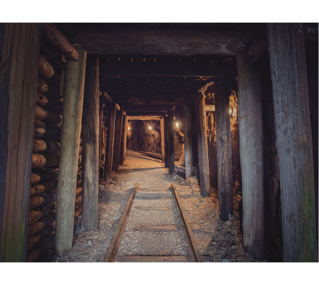
ANALOGY
The main entrance structure aims to connect the two functions of the building – exhibition and archive. Its form and material make direct reference to the building’s function as a mineral collection and mining archive. This mining theme can be clearly seen in the use of diagonal lines which hint towards the slanted form of traditional wooden logs within a mining tunnel. The use of this diagonal line continues throughout the rest of the building and can even been found in small details such as the stair handrail. The rough concrete material is also influenced by a mining tradition known as ‘scraping’ (scharrieren) in which the surface is broken by hand in order to make the aggregates visible. This creates a conscious contrast to the existing historical courtyard.
CHANGE IN SCALE
light spacious inviting place
big change in scale
WHAT
COSY
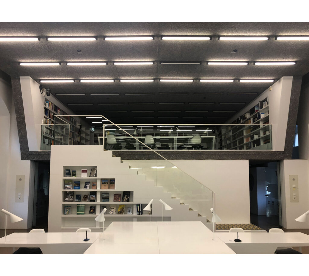
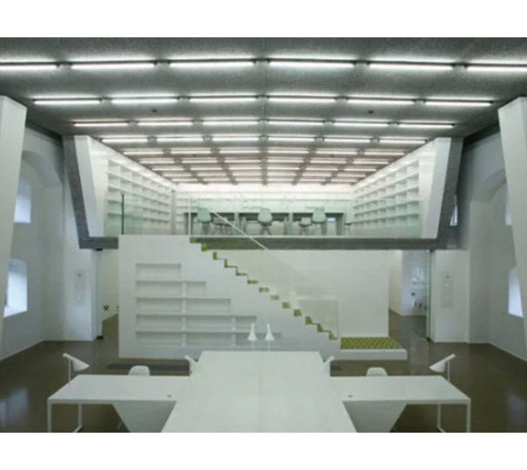
In the reading room I felt comfortable because it was all very light and spacious. It did however also make a very sober and impersonal impression on me. The first thing I noticed were the stairs leading towards the upper room which made me want to know what is happening up there. I felt invited to use the stairs as they were covered in a carpet with a striking pattern. In this space I immediately felt much more comfortable, and I even had a sensation of cosiness. I felt safe and hidden up here, being able to look down upon the whole room. I thought to myself that I could stay here longer.
HOW
INVITING
A strong contrast in materiality and colour makes the transition into the reading room very welcoming. Here the main colour is white, which helps to reduce distraction and puts focus on the different structural bodies in the space. A colourful and cosy carpet lines a staircase in the centre of the space, which invites the user to explore the upper space. Here, a big change in scale in the form of ceiling height helps the user to feel more comfortable and protected. From here, the user can observe the rest of the space from a safe and cosy atmosphere, which also allows the user to want to stay longer.
WHY
MAKING REFERENCE
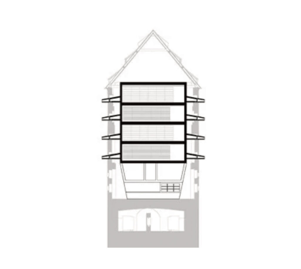
As an archive, the Bergarchiv has the function of storing and protecting archived material as well as making it accessible to the public. This functional role is expressed in the architecture by a large concrete shell which aims to ‘protect’ the archives whilst also making reference to the levels of a mine. The ‘bulging’ (aufwölben) of the structural shell within the public viewing room also creates a spatial form that is reminiscent of a mine tunnel. The aesthetics of the reading room are kept minimal in order to allow the viewing of the archives to become the main focus. In contrast to the rest of the room the upper library space was designed to be small and pleasant in order to allow visitors to feel comfortable and stay long.
INTENSE
green abstract space
big contrast
WHAT
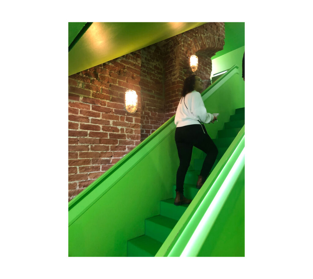
JOY
I found this space the most fascinating and beautiful space within the entire building. It was an intense colour experience that evoked a strong feeling of joy within me. I was curious to explore this space and I really wanted to know what was behind the doors. I liked the big open space and thought to myself ‘here would be a good place for a party!’. Looking at the tall brick wall, I felt invited and guided to go up the stairs. I felt like the warm brown wall was a very important contrast to the intensity of the green, as it felt very ‘earthy’ and ‘stable’ in such a ‘futuristic’ and ‘spaced-out’ space. The brown colour stopped the green from being too overpowering and made that space more pleasant.
HOW
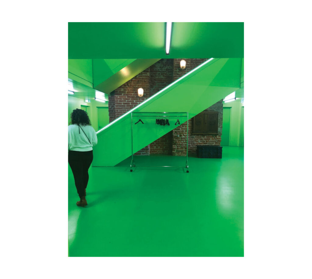
CONTRAST
This atrium and its hallways to the office rooms provide the user with a very intense and overwhelming sensation due to the use of one strong colour – green. This is emphasised through the seamless transition of this colour and its materiality from floor to wall to ceiling. The use of strong contrast is applied in the space to provide a balance to the ‘futuristic-like’ green space through the rawness of an original existing brick wall. Due to the high proportion of this wall and the green staircase that wraps itself around it, the user feels invited to move up the stairs into the higher levels. The placement of the staircase directly next to the brick wall allows the user to be close to something ‘warm’ and earthy’ in an otherwise ‘cold and sterile’ space.
WHY
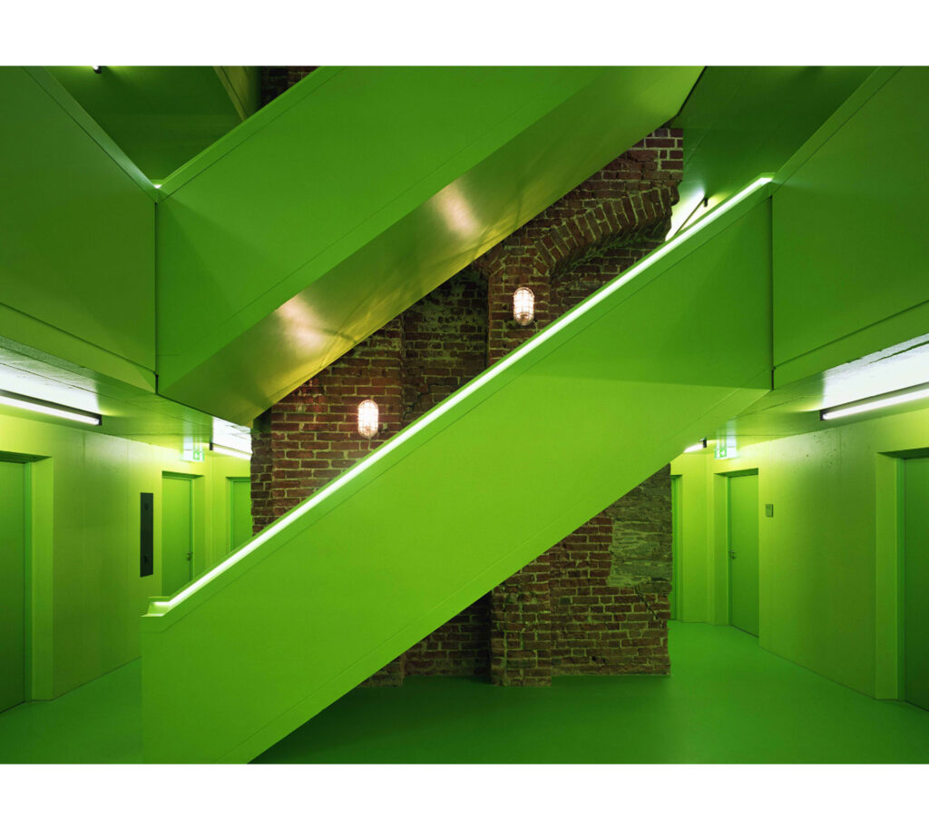
DISTINGUISH
The architects made a deliberate decision to make a clear contrast between the existing building, and its new functions. Certain historical walls and staircases were left untouched in their appearance, whilst new additions such as this atrium and its office rooms were designed to stand out and provide great contrast to the existing. In this way, all new interventions remain recognisable through a modern architectural language and follow the basic principle of preserving the existing and modernising the new. The use of bold colours, such as green, purple and yellow, enhance this principle even more.
One particular aspect became very clear to me throughout the course of this seminar, namely the notion of the Embodied Image as Juhani Pallasmaa describes it. This became more and more evident to me with each task as I discovered the importance of the architect to create spaces that people inhabit and experience as atmospheres rather than just creating an ‘image’. Through a closer study of Pallasmaa ideas I gained a deeper insight into the individual connection between a person and all aspects of their spatial environment which play an important role on their emotional and sensory response to the space.